Currently studying for an MA in Illustration from Kingston University, I have decided to set up a new blog to share my secondary research and analyse my learning, making it easier for me to reflect upon my progress and improve on any weaker areas. As well as assisting me when writing analytical essays on my findings and learning.
Visual Research Boards Project one:
Build upon your initial secondary research by investigating the historical/cultural and contextual significance of illustration, and by asking how illustration differs from fine art for example.
Bring 4 x A3 landscape runouts that collate the findings of your investigation for presentation to your peers.
Page 1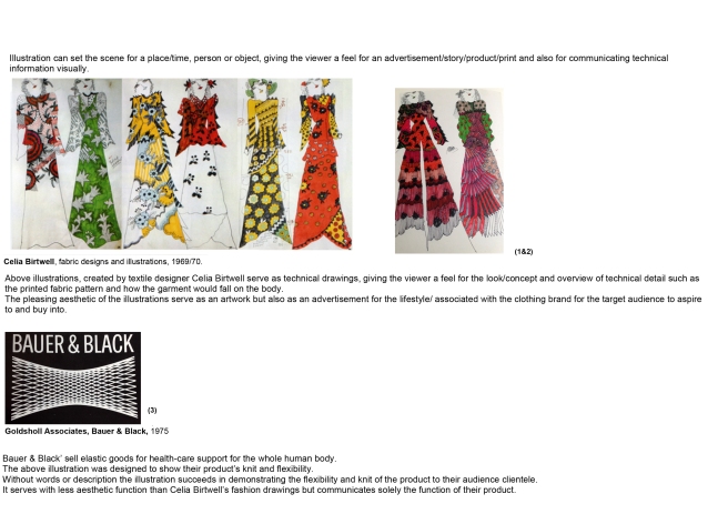 Page one focuses on Illustration and how it can be used in a spectrum of diverse contexts to appeal to its target market.
Looking through contemporary Fashion Illustration literature and 80’s books on Graphic Design I decided to discuss this point by looking at one of my all time favourite Illustrators/Textile Designer Celia Birtwell.
In the above images (1&2) the viewer sees a series of Fashion Illustration’s in Birtwell’s signature style, the illustrations have a function to the viewer to indicate the intended look of the garment’s, the cut, how they will fit on the body and the print as well as appealing to a lifestyle/look Birtwell’s audience/followers aspire to and might buy into….I feel they serve as an Artwork in themselves as well as a visually descriptive tool for a product/garment design.
In contrast to Celia Birtwell’s Fashion Illustrations, Image three illustrates medical support wear for sports injures by Bauer & Black. The image clearly illustrates the use of the product and its flexibility without serving as an artwork which has aesthetic intent.
Page 2
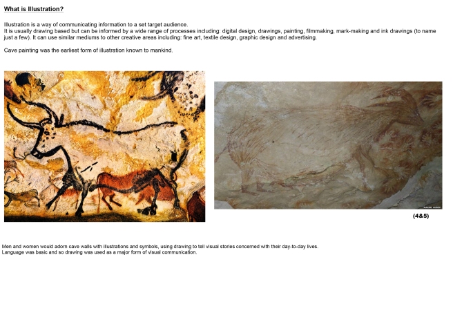 Page 2 was created to look at the history of Illustration and how it originated. I found this area incredibly stressful to research, firstly covering such a broad area in such a small amount of space and secondly it was very hard to find trusted sources/essays explaining this history in any depth, so I just touched upon the origins of illustration as cave paintings.
It was fascinating to have the lack of Illustration history available explained to us by our lecturer. Art history is accessible and easy to source information on whereas illustration isn’t, why is this? Is there a hierarchy? If so why?
This made me aware of the abstractness of the questions and the importance of being confident in expressing my ideas and findings as well as arguing and challenging convention.
Page 3
 Page three compares examples between fine Art and Illustration, how they differ. My initial ideas of the main difference between the two art forms was accessibility…Illustration targeting a specific target market and ensuring an idea/character/story is clearly visually communicated to that market and conceptual Fine Art often being accessible to a very niche market only.
Upon further reflection I found myself going in circles at the differences (any other art forms under the same creative umbrella e.g advertising, graphic design and surface pattern design) are communicating similar ideas to fine art and I believe the starting point for all areas would be from the same place; research….research of the select topic, context and research of the specific target market, whether being used to sell a product or create a piece solely for impact/shock/making a statement.
Could the main difference between an Illustrator and Artist be solely that an Illustrator is working to set a brief (often commercially) and has to ensure the artwork created is accessible to who-ever they are targeting.
Image 6 (featuring Superdrug wet wipes) I felt to be a perfect example of targeting a select audience through Graphic Design/Illustration. Without many words the image of a sticky ice-lolly and leaking jam donut on the front of the packaging instantly had a physical affect on me, making me want to wash my hands or indeed use wet wipes to cleanse my hands from a sticky feeling. When pointed out by my lecturer I also noticed the Phallic symbolism of the dripping ice-lolly and at closer inspection the vulval imagery of the donut with jam oozing out (which could also be evocative of menstruation) and the need of wet wipes.
Image 7
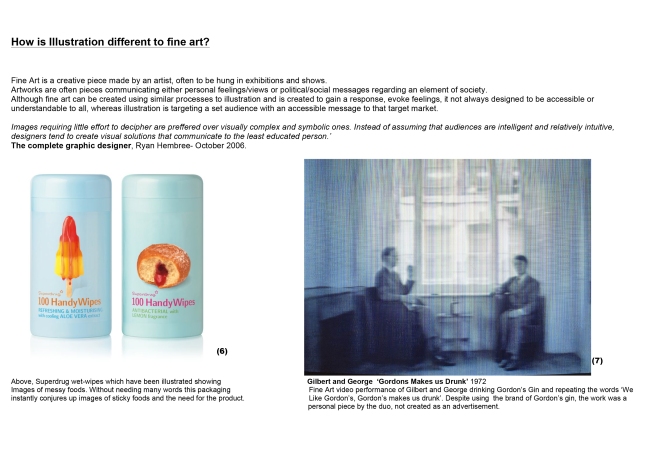
Image seven as an example of a conceptual/fine Art piece featuring Art duo Gilbert and George (video) drinking Gordon’s Gin and repeating the words over and over ‘I Like Gordon’s, Gordon’s makes me drunk!’ This piece wasn’t created as an advert to sell gin for Gordons.
I was excited by my findings from this first, one week project and feel as though my ideas are being pushed.
It was interesting to see how the other thirty students on my course interpreted the brief, such a diverse selection of images, writing and ideas. However from the beautiful, imaginative creations of my fellow classmates I felt my presentation was indeed lacking and needs more personalisation (this needs my attention).

