This second one week project:
Continue to critically evaluate your own practice by reviewing the practice of someone else. Do this by selecting TWO contrasting practitioners. One whose work you admire or are influenced by, and another whose work is less familiar and that you have possibly discovered during your secondary research. Analyse their process; for example, you may consider exploring their work by adopting their methodology. In this way you are supporting your secondary research through primary investigation. What wil you learn through this exploration? How will it influence and enhance your own practice without simply becoming a mimicry of style?
Collate your findings onto 3 x A3 landscape run-outs.
I approached this brief by immediately reaching for my all-time favourite childhood book ‘Babar The Elephant’ – Jean De Brunhoff.
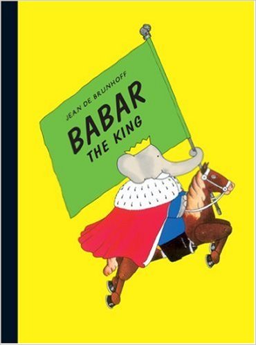
I have a great deal of childhood memories and nostalgia linked to these stories (in particular ‘Babar The King’), when as a small child my mum would read me the original vintage book (printed in the 1930’s). The writing was advanced and complex for a children’s story, the illustrations, imaginative and quirky yet rich in detail with drawings to scale and in perspective, illustrative delights to be withheld every few centimetres (the closer you look the more you see).
The colours used in the book have always fascinated me, Jean De Brunhoff appears to stick to a set colour scheme throughout the whole book, yet each page jumps out due to this colour scheme and clever co-ordination.
As a very personal viewpoint I generally prefer vintage children’s books and toys to contemporary as I feel the Illustration’s complexity gives them a great deal more character and contemporary toys which walk/talk and make noises possess far less charm than vintage toys and games, not to mention putting a block on the imagination of children who are less likely to devise games and situations for their little characters when their contemporary toys walk and talk.
I felt that comparing my vintage favourite to a contemporary children’s story book might help enlighten me on what is popular ‘now’ and why (maybe delving into another story and learning more about its context would alter my views, or not…)
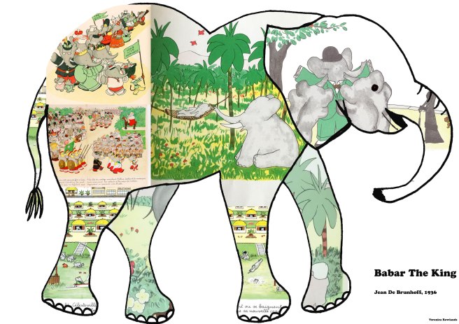
Purely for the purpose of displaying illustrations from the story, I chose to use one full sheet, customised into a hand illustrated elephant template (also to personalise).
Babar the Elephant board 1
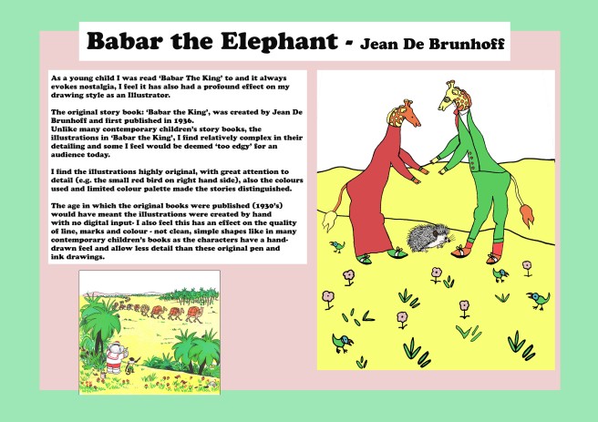
During the tutorial all student’s design boards were adorning the classroom walls, in amongst thirty-three peer’s work I felt my original boards became lost and looked un-uninviting in amongst the other beautiful design boards on display.
I also saw that classmates had designed their own characters based upon the style of the Illustrator(s) which they were studying. I didn’t want to miss this opportunity, so re-visited my research boards and created an Illustration with a similar layout and using the colour scheme from one of my favourite pages in ‘Babar The King’ (apart from my illustration and background colour/border the content is almost the same as my original).
I very much enjoyed creating my own characters in this style and using Jean De Brunhoff’s colour palette, I was aiming to create a detailed piece which is visibly hand drawn (Jean De Brunhoff’s were created before computers).
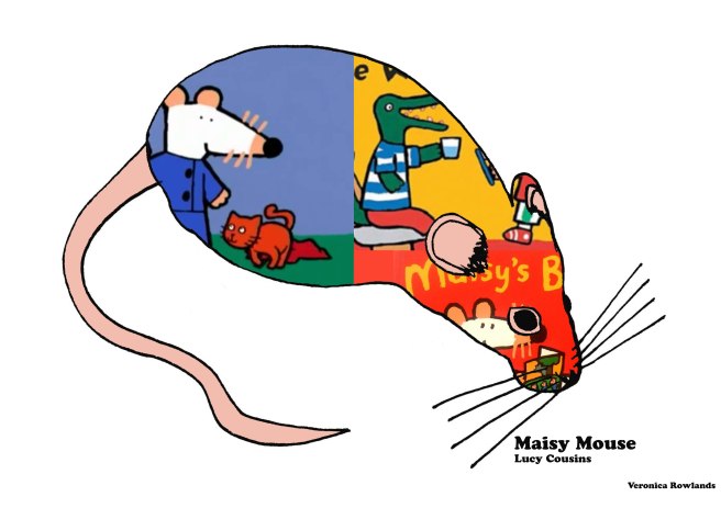
Maisy Mouse Board 1
In the same style as my initial board for Jean De Brunhoff’s ‘Babar the Elephant’, I used a mouse template to drop illustrations from Lucy Cousin’s ‘Maisy Mouse’ story books inside (not having a story book to scan, it was hard to find images which didn’t go pixcellated) – I’ll go back and amend some of the less sharp images before submission.
Maisy Mouse – board 2
As before the content of the board is the same apart from the background colour and my own illustration and annotations based on Lucy Cousin’s style.
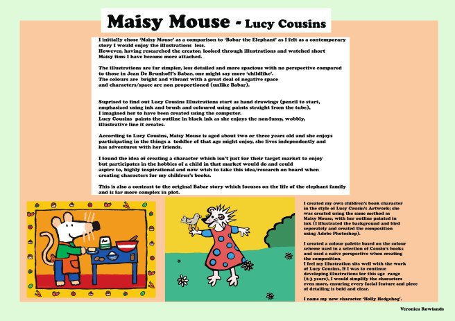
I was convinced that I wouldn’t appreciate the illustrations in Lucy Cousin’s work as much as I love the ones in Jean De Brunhoff’s ‘Babar the King’, however after watching several video’s on Lucy Cousins and a ‘Maisy Mouse’ episode I started to grow fond of the characters; I imagined that Maisy was illustrated digitally and was surprised to find out that she was in-fact painted using ink as an outline and watercolour paints.
The target market for the Maisy books are toddlers so this explained the simplicity of the characters, shapes and naivety of the images…
Although this might sound obvious, I was very intrigued by the story lines for Maisy; whereby she is supposed to be a toddler herself and therefore enjoys participating in activities which young children of the same age often do, she works almost as a role model, she’s independent and a good friend.
In this instance my personal view to contemporary children’s books having less charm than vintage has been changed (my personal opinion is now that both stories have an equal amount of charm)…..
This second one-week design board project has taught me a great deal, especially seeing the importance of presentation and ensuring one’s design research stands out and is aesthetically exciting to the viewer. Seeing all of the work up in the classroom made me aware of how easy mine initially was to miss, to even be read it needs to have visual impact and when writing to publishers or presenting ideas to clients in the future the first step is ensuring they are engaged with the product.
Secondly, I have spoken of my personal preferences throughout this blog post, but am aware that when designing for the market, I might well be Illustrating for people with entirely different tastes to me e.g. Designing for small children or elderly people I need to remove bias of personal taste and put the hours into researching to ensure it is correct for my target market.
Thirdly, I was asked to create three pages and I have created four, I need to focus on being concise and finding a way of communicating the relevant information in smaller paragraphs/bullet-points so that they are not overlooked.
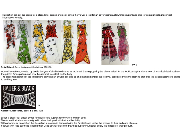 Page one focuses on Illustration and how it can be used in a spectrum of diverse contexts to appeal to its target market.
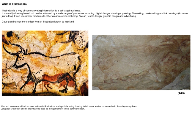 Page 2 was created to look at the history of Illustration and how it originated. I found this area incredibly stressful to research, firstly covering such a broad area in such a small amount of space and secondly it was very hard to find trusted sources/essays explaining this history in any depth, so I just touched upon the origins of illustration as cave paintings.
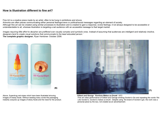 Page three compares examples between fine Art and Illustration, how they differ. My initial ideas of the main difference between the two art forms was accessibility…Illustration targeting a specific target market and ensuring an idea/character/story is clearly visually communicated to that market and conceptual Fine Art often being accessible to a very niche market only.
